Did you know that the WCC just got a new logo?

Collapse
X
 
  • Filter
  • Time
  • Show
Clear All
new posts
  • jazzdelmar
    Zag for Life
    • Feb 2007
    • 22838

    #46
    Cooper was the epicenter for the power designers, but don’t sleep on Parsons, SVA, RISD, Art Center and Pratt. Let’s talk. Who was the great female designer who worked with Herb?


    Originally posted by TheZagPhish View Post
    Yep! Oh man, that is so cool! I am a pro letterer these days (a term that would be utterly unknown to the greats you just listed), and find most of my direction in the work of the past. These days it is Ken Barber carrying the torch of the masters, guiding the kids to do it right with pencils and practice. After attending a workshop of his this past June in SLC, Mrs. Phish and I are working to find a way out to Cooper Union to take another class of his next year. I miss NYC and can't wait to see it with a designer's eye and more time.

    Five stars for the Lubalin reference.

    Comment

    • TheZagPhish
      Zag for Life
      • Feb 2007
      • 10863

      #47
      Originally posted by jazzdelmar View Post
      Cooper was the epicenter for the power designers, but don’t sleep on Parsons, SVA, RISD, Art Center and Pratt. Let’s talk. Who was the great female designer who worked with Herb?
      I don't know! I'm intrigued.

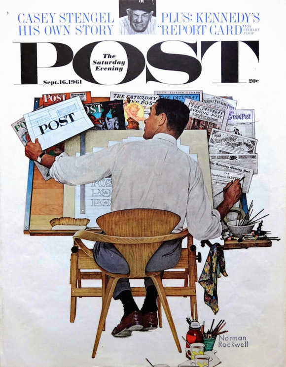
      That guy was cool in 900 different ways. Norman Rockwell painted him redesigning the Saturday Evening Post type!

      Once in a while you get shown the light, in the strangest of places if you look at it right

      Comment

      • Mantua
        Zag for Life
        • Mar 2007
        • 3339

        #48
        Originally posted by Radbooks View Post
        It's kind of ugly...
        My first thought!

        It doesn’t look contemporary.

        Done by an intern with no design background? I like the blue-green color range, but that choice is too much in the middle and too saturated. It also doesn’t describe West Coast waters.
        Bonjour tristesse.

        Comment

        • Kiddwell
          Zag for Life
          • Feb 2007
          • 3027

          #49
          So I'm lookin' in the mirror,...

          ...tattoos go on foreheads, right?


          :[
          Yeah, we're "The Champs," uh-huh!

          Comment

          • Mantua
            Zag for Life
            • Mar 2007
            • 3339

            #50
            Originally posted by Kiddwell View Post
            ...tattoos go on foreheads, right?


            :[
            You can rap, Kiddwell?
            Bonjour tristesse.

            Comment

            • DZ
              Zag for Life
              • Sep 2007
              • 18744

              #51
              Originally posted by jazzdelmar View Post
              So you must be familiar with U&LC, the bible of mid-century font design that involved so many power designers such as Herb Lubalin, Bass, Glaser, George Lois, et al. I knew most of them. Glaser was/is a pizzer as is George.
              You wouldn't believe the number of "otherwise fairly well-read" people who lived quite a while without knowing that "font design" was really a thing that went beyond those choices on Word.


              Now I do appreciate that its a whole industry, "presentation," art and science. I wouldn't have known at all until reading an article a few years ago on the design for the "Delta" font and logo. They referenced it as genius and long lasting. I was blown away. Five letters Triangle-type things.

              But I now see the subtlety makes a massive difference.
              Whenever you find yourself on the side of the majority, it is time to pause and reflect.
              Mark Twain.

              Comment

              • jazzdelmar
                Zag for Life
                • Feb 2007
                • 22838

                #52
                Enjoy.

                Show a Hindu the Swastika and he might look at it in reverence. Flash the devil's horn at a metal-head from the Baltic region and he might come after you with a vengeance! Confused? Many symbols mean different things for different cultures.


                Originally posted by DixieZag View Post
                You wouldn't believe the number of "otherwise fairly well-read" people who lived quite a while without knowing that "font design" was really a thing that went beyond those choices on Word.


                Now I do appreciate that its a whole industry, "presentation," art and science. I wouldn't have known at all until reading an article a few years ago on the design for the "Delta" font and logo. They referenced it as genius and long lasting. I was blown away. Five letters Triangle-type things.

                But I now see the subtlety makes a massive difference.

                Comment

                • TheZagPhish
                  Zag for Life
                  • Feb 2007
                  • 10863

                  #53
                  Originally posted by DixieZag View Post
                  You wouldn't believe the number of "otherwise fairly well-read" people who lived quite a while without knowing that "font design" was really a thing that went beyond those choices on Word.


                  Now I do appreciate that its a whole industry, "presentation," art and science. I wouldn't have known at all until reading an article a few years ago on the design for the "Delta" font and logo. They referenced it as genius and long lasting. I was blown away. Five letters Triangle-type things.

                  But I now see the subtlety makes a massive difference.
                  A few words by arguably the world's foremost expert on type design, Matthew Carter.
                  Once in a while you get shown the light, in the strangest of places if you look at it right

                  Comment

                  • caduceus
                    Zag for Life
                    • Mar 2007
                    • 5158

                    #54
                    Originally posted by seacatfan View Post
                    I believe they compete in the WCC in all sports with the exception of football of course. I know for certain they compete in women's volleyball and are a powerhouse. The WCC was already strong in that sport and BYU has added to that. Generally considered the best non P5 conference.
                    BYU participates within the WCC for all athletics except:

                    Mountain Pacific Sports Federation
                    ● Men's and women's swimming and diving
                    ● Men's volleyball
                    ● Men's and women's indoor track & field

                    Mountain Rim Gymnastics Conference
                    ● Women's gymnastics

                    Eastern College Athletic Conference
                    ● Outdoor men's and women's track & field

                    Independent
                    ● Football


                    That said, I'm not fond of the new logo, nor much of anything that the WCC does.

                    I wonder how it'll actually look on uniforms and court floors.

                    Comment

                    • DZ
                      Zag for Life
                      • Sep 2007
                      • 18744

                      #55
                      Originally posted by TheZagPhish View Post
                      A few words by arguably the world's foremost expert on type design, Matthew Carter.
                      I listened to that one the last time you fascinated me with this topic. Thanks again, I listened again.

                      And Jazz - those were about as long lasting as they come. The "logo" thing I guess I sort of knew "someone had to come up with that" but didn't know the difficulty behind it. The font design blew me away, an art unto itself and they would use an entirely new design for 5 letters, as in "Delta"
                      Whenever you find yourself on the side of the majority, it is time to pause and reflect.
                      Mark Twain.

                      Comment

                      • rennis
                        Zag for Life
                        • Oct 2007
                        • 2857

                        #56
                        The "C"s look like the open end of a box wrench. Not sure what hex-head bolts have to do with our conference.
                        Originally posted by Coach Few
                        We are not here as a #%$&%&! Courtesy!!!

                        Comment

                        • TexasZagFan
                          Zag for Life
                          • Feb 2007
                          • 10548

                          #57
                          Originally posted by rennis View Post
                          The "C"s look like the open end of a box wrench. Not sure what hex-head bolts have to do with our conference.
                          Instead of pop-up ads from DUI Attorneys, maybe the WCC can do a sponsorship deal with Snap-On Tools.

                          Comment

                          • DZ
                            Zag for Life
                            • Sep 2007
                            • 18744

                            #58
                            The conference could have done much worse than picking five or so "finalists" and then spreading them out as "Beta" versions on every board in the conference (fans are the ones they're trying to attract, not media specialists at the schools), and getting a sense of which are the best of the five, going from there.


                            There's actually some strength in looking to crowd source the eval process. Takes some real leadership to say "I want broad input."
                            Whenever you find yourself on the side of the majority, it is time to pause and reflect.
                            Mark Twain.

                            Comment

                            • Birddog
                              Zag for Life
                              • Feb 2007
                              • 7735

                              #59
                              Originally posted by rennis View Post
                              The "C"s look like the open end of a box wrench. Not sure what hex-head bolts have to do with our conference.
                              Good call it's somewhat reminiscent of Matco Tools
                              Birddog

                              Twas brillig, and the slithy toves
                              Did gyre and gimble in the wabe:
                              All mimsy were the borogoves,
                              And the mome raths outgrabe.

                              Comment

                              • LongIslandZagFan
                                Moderator
                                • Feb 2007
                                • 13951

                                #60
                                In regards to the logo...


                                "And Morrison? He did what All-Americans do. He shot daggers in the daylight and stole a win." - Steve Kelley (Seattle Times)

                                "Gonzaga is a special place, with special people!" - Dan Dickau #21

                                Foo me once shame on you, Foo me twice shame on me.

                                2012 Foostrodamus - Foothsayer of Death

                                Comment

                                Working...
                                X