-
But we don't play nobody. -
It's kind of ugly...“When I get a little money I buy books; and if any is left I buy food and clothes.”
~ Desiderius Erasmus -
not to be rude but my first thought was "who cares"
Comment
-
Yep. Looks kind of amateur.Comment
-
Doesn't look like an improvement to me. I wonder how much money they wasted on this?Comment
-
Maybe they pay for the rebranding effort with better conference branding and licensing fee deals, regional broadcast rights, and . . . What other leverage comes beyond the lofty bromides found in the linked press release ?
Side note: this was previewed in March ? Hard to believe it didn’t hit the GUB radar until now.
Sent from my iPhone using TapatalkThe GUB Resource Library: Links to: Stats, Blogs, Brackets, & More. . .
“They go to school. They do their homework. They shake hands. They say please and thank you. But once you throw that ball up, they will rip your heart out and watch you bleed.” -- Jay BilasComment
-
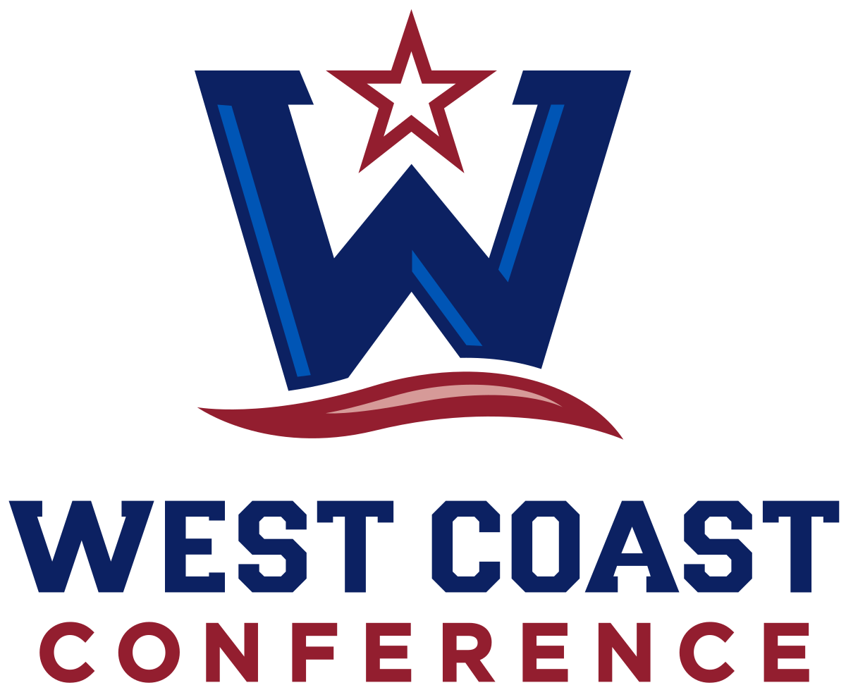
Teal color reminds me of Zags’ unis celebrating Native Americans.
The tag line motto at end of video: Our Way Is West. What values, vision, identity does that communicate? What does it even mean? How about something more straightforward like: We Are The West.Even though I care a lot about my basketball opinions, they are like comparing a bicycle to a championship motorcycle who is our coach. . ZagsGoZagsComment
-
I can be a stickler for consistency of font, alignment of graphics, etc.
It's good that the "W" in the word West has the same shape as the large "W" above it ...but... the small "W" is not aligned directly below (it's shifted a bit to the left).
Also, the "C" in Coast and Conference is not the same font as the large "C" above ... that's what bugs me the most.
Oh well, not my call of course. Go Zags!Comment
-
I really liked how the popup ads, especially from the DUI attorney, distracted me from the message presented by the Conference...or Legend Labs. Not sure who was promoting whom.
I mean seriously, can't the conference office take their share of the money from us and spend it on a website that has no popup ads? As others said, it's amateurish.Comment
-
seems like some small organizations, without a huge task to accomplish, try to grow themselves
old logo huh? i didn't know the WCC had a logo, though I am sure I have laid eyes on it hundreds of times
yawn
new logo, huh? looks ok to me
colleges do all the work to create teams and travel to intra conference games,
and the coaches could do most of the scheduling work themselves,
I am sure there is a need, but I hope the colleges do not pour too much money into the WCC offices.
That money could be better spent putting the teams and programs together at their own university.
not that I know much about it, and maybe I am skeptical of them blowing their trumpet too muchComment
-
An ongoing downgrade, in my opinion. Always amazed how much gets paid for graphic design firms to come up with uninspiring logos...


Comment
-
Couple comments:
1. Points as much east as west; what’s up with that?
2. Looks crowdsourced
3. Very 2000, like the logo of an iffy tech IPO
4. Strong Silicon Valley influence
5. Too many stagnant parts....
...for starters.Comment
-
Meh. A side-grade.I will thank God for the day and the moment I have. - Jimmy VComment
-
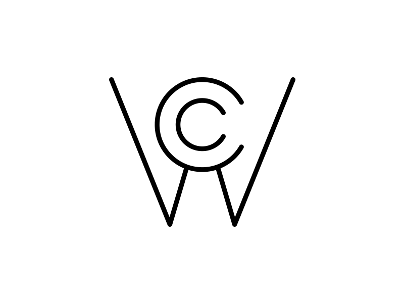
What about (at least it resembles 'logos'):

Comment
-
I like that top oneComment

 Tweet
Tweet


Comment